
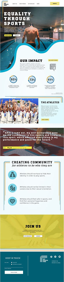
Out Athlete Fund
Responsive web redesign for a LGBQT nonprofit supporting equality in sports.
UX Designer
UI Designer


Project Overview
Out Athlete Fund is an organization that works to fundraise and sponsor up-and-coming athletes to professional levels within the LGBTQ+ community, as well as build awareness around the prejudices and challenges LGBTQ+ athletes still face today. Coming out of the pandemic when much of athletics and donation efforts were paused, the Out Athlete Fund wanted to reemerge and reinvent its approach to supporting athletes by working more strongly with prominent partners, and they needed am updated website to reflect this new vision.
My focus for this project was on the research and UX phase of the project. I built the new site map and wireframes, including recommendations for future growth for the organization. I also contributed to the visual design and branding phase of the project.
MY ROLE
UX/UI Design
UX Research
Information Architecture
TIMELINE
October 2022
(3 weeks)
TEAM
Roberto Arras
Evan Henderlong
Gabe Rodriguez
Jenny Chute
Goals
We were tasked to do a full responsive redesign of the Out Athlete Fund website, including rebranding and a new logo.
By interviewing the founder of Out Athlete Fund and getting a better sense of his vision and why he started the nonprofit, it was clear that these values were not reflected on the existing website. Our goal was to redesign the website to better explain the mission of the organization, bring a more personal touch to the website, and better help build trust between potential donors and Out Athlete Fund.
Lacking a clear purpose
At first review, the basic "why" and "what" of what a potential donor would be supporting was not clear. The existing site consisted of a single landing page with sections anchor-linked from the global nav, and a donate CTA that linked offsite to a donation platform with no further information. In doing a heuristic evaluation and baseline user testing, it was clear that the site needed a visual update as well as more robust content to meet basic expectations for a potential donor to commit to supporting the cause.
Not accessible
Visuals and copy didn't meet accessibility standards, and were challenging even for people with full visual capabilities.
Unclear mission
The mission of the organization isn’t clear or compelling to potential donors, and doesn't explain how things work.
Confusing hierarchy
The flow, organization, and layout of content creates a confusing user experience and doesn't provide easy answers to common questions.
No consistency
Formatting of content doesn’t align to one another, and content is cut off by page margins.
Missing key visuals
Images don't support the content, and don't aid in building trust or affinity for potential donors.
Before

After
%20(1).jpg)
Build trust with the donors
We knew to improve the site, we needed to understand what motivates a person to donate to a cause. To get a better sense of the users that might be visiting the site, we decided to interview both athletes and potential donors. Although we determined donors would be the target audience for the site, we still wanted to understand the LGBTQ+ athlete experience first-hand so that we could better empathize with them and tell their stories and struggles through narrative content on the site. We also interviewed the founder of Out Athlete Fund so that we could address any business needs and better tell the history of the organization and the foundations of their work.

Goals
During our interviews, we asked participants about their donating behaviors and motivations to get a better understanding of how and why they donate to various causes they care about. We then observed them as they performed a few tasks on the existing website to get a better sense of user challenges with the current design, and asked questions on their experience. Our goals from our user interviews were to understand better:
-
Donation habits, behaviors, and motivations
-
Types of information a potential donor looks for on a website before they make a contribution
-
Impressions of the current website, and if it had the right information for a user to feel confident donating
How people make donation decisions
Through our interviews, we found that the primary drivers for people donating to a cause was personal connection and trust. People give to causes and communities that they care about, and they want to make sure that any time or money donated is actually making an impact and the organization is capable and trustworthy. They want to know their money isn't going to waste.
This personal connection and trust between a nonprofit and a potential donor is built with transparency and narrative content. The donor wants to know how the money is being used, and how the organization's work is making an impact on the community or cause they serve. The donor wants to know that the organization is legit and their work is effective. Donors feel confident in the organization when they see evidence of the impact being made and narrative video or static imagery of the organization in action.
.png)
How can we meet these goals?
We found that the current site was not meeting the basic fundamentals of what inspires a potential donor to support the cause. It's mission statement was verbose and hard to understand, it was lacking detailed content on how the money is used, did not provide any context on the issues that the organization was combatting or why a donor should care, and didn't include any information on the athletes themselves or stories that would give a donor something to epathize with.
In summary, the existing Out Athlete Fund website did not address the majority of the fundamental questions a potential donor may have when deciding whether or not to support a cause. It was clear we needed to design a new website to address these questions, and give donors the information and narrative they needed to feel confident they are contributing to an organization they can trust and that they feel connected to.
Our redesign had the following goals in mind:
-
A clear mission statement and overview of the organization
-
What the impact is for the community
-
Personal athlete stories to help donors identify with the issue
-
How the scholarships work and where the money goes
-
Historical context of both the organization and the social issues
-
How to get involved either through donating or through events or volunteering opportunities
Problem Statement
How might we redesign the Out Athlete Fund website to more clearly communicate its mission and potential impact, so that donors can connect personally to the cause and are inspired to get involved, donate, and support the mission of increasing LGBTQ+ representation in sports?
Answers to a donor's questions
With clear insights from our user research that donors need more information to build trust with an organization, I was ready to begin the information architecture for the new site. Since the existing site was fairly small and missing key content, I had to identify where the content gaps existed and how best to fit it all back together into a cohesive structure and design.
Shape the narrative of the nonprofit
Using the data we received from our interviews, we did some categorization and feature prioritization exercises. Combining this information with inspiration from a competitor analysis, I started exploring variations for an ideal information architecture. I knew Out Athlete Fund may not have the content available yet to fill the holes in the narrative for the website, but I wanted to explore what it could be so we could have a future vision that the client could strive for. Ultimately, we had to scale back the content and pages to meet realistic goals and what the organization is capable of today, but the client found it useful to see what opportunities they could potentially pursue.
Option 1

Option 2

Option 3

Option 4

We chose to move forward with option 4, since it pulled from content and narrative we could easily create, and was a viable option for a phase 1 approach. I then explored a variation of the website architecture that laid out the hierarchy of content for each page in preparation for our wireframes.
Site Map
.jpg)
Key
Introduce trust-building content
Using my website architecture to guide our content hierarchy, we set out to design our wireframes in Figma. We pulled what we could from the existing website to use as content, but majority of the messaging and content buckets we had to create ourselves. We did this by pulling insights from our athlete and stakeholder interviews, as well as additional resources found online such as articles, personal stories, and infographs.


Did our designs build trust?
With wireframes ready, we created a prototype so that we could do some initial user testing. We tested with 6 different users, and observed as they performed a few tasks. We wanted to be sure the content and structure of the our new web designs addressed the needs of potential donors and built the trust we wanted to create with our users.
-
Is the updated mission and purpose clear?
-
Does the organization feel trustworthy?
-
Is the navigation intuitive?
-
Is there enough info on the site to make a donation decision?
-
Is it clear how to engage with the non profit and get involved?
User Test Results
After testing our wireframes, we confirmed we were on the right track. Our tests showed us that new designs were clear and easy to navigate, but there were still some areas that could use improvement.
Mission was intuitive, concise, and easy to find
How the organization works and what it does was clear
Was easy to find info on the social issue and the affected community
How to donate was straight forward
Users wanted to see more on credibility and impact of the org before donating
Ways to get involved were not clear (What does it mean to volunteer?)
Events were confusing (what is an event for this organization? Why attend?)
How donations were spent and how the scholarship worked needed clarity
Design visuals that build affinity
Given the design challenges with the existing website, including the lack of story-driven photography, we knew we would need to create a new brand that would support our goal to build affinity between the potential donors and the athletes they were supporting. The brand should work harder to bring the athletes stories to life and build trust with potential donors.

Tell a story through history
For the new brand design, we wanted to move away from the traditional LGBQT+ rainbow and tie the design closer to the world of sports. We decided to take inspiration from the athletic history of equality in sports. Social change is a long road, built on the shoulders of those that fought before us. When change feels like it's moving too slow, it's important to remember the history and how far we've come. We designed our brand to bring this history forward, as the fight for equality continues into the future.
Inspiration
%20(1).png)
Brand Colors
Asset Samples
.png)
Logo Design
Buttons
.png)
.png)
Iconography
Typography

%20(1).jpg)


Reflections
The new designs were well-received by our stakeholders, and they were eager to implement on the website. Since our designs included sample content, Out Athlete Fund will need to purchase or create their own content to finish telling their story, and bring the site to life. In addition, we knew the organization itself was going through some big changes with restructuring their scholarship program, so when exploring the website architecture I wanted to make sure we were planning both for a future to come and a phase 1 that could be implemented today. Future iterations of the site will need to include more robust information on partnerships, as the target users will shift away from individual donors to corporate sponsors.
It was exciting to think about what could be, knowing my creative work could influence future planning for the organization. Designing a company's website is a deep partnership, because ultimately we are helping them identify their core mission and values so that they can convey that externally. Through designing a new website for the Out Athlete Fund, we asked the leadership team questions they never thought to ask, and in doing so we helped them know their own story better. We were able to uncover the core of who they are, why they exist, and what really matters when telling their story to donors.

