
Van Guru
Product design to support the van life community, and address the challenge of overwhelming and scattered resources.
Product Designer
UI Designer


Project Overview
Van Guru is a web-based product designed to be a one-stop destination for all things van life. While researching for this project, we realized one of the biggest challenges for the van life community was the research itself – it was time-consuming, scattered, and there was an overwhelming amount of information and resources available with no centralized community or clear place to start.
Our goal with the web product was to help both beginners and experts find the information they need from trusted sources and van life experts. We conducted user research and fully explored the van life community so that we could put together a strategy, designs, branding, and user tests for this new centralized community hub.
MY ROLE
Product Design
UX Research
Information Architecture
TEAM
Evan Henderlong
Steven DeTray
Mindy Coppo
Stacy Davidson
TIMELINE
December - January 2023
(4 weeks)
Goals
We set out to create a product to support people interested in van life, and through extensive research we found that the best product we could create was a centralized community backed by trusted experts. Information, from how to choose a van to recommendations for what to do on the road, was scattered across the internet and quickly became overwhelming. Our goal was to design a responsive website that could connect people and guide them along their van life journey, and could be their trusted resource no matter what questions came up.
Why do people do van life?
Our team aligned on a shared passion for the outdoors, and with van life emerging as an exciting way to travel and adventure outside, we wanted to create a product that would connect with this community. But first, we had to understand who our users were, their needs and motivations, and what resources were already available to them. This research would inform how our product could solve for existing user issues, and be a valuable resource to people in the van life community.


User Research
-
Competitor analysis
-
Survey & user interviews
-
User persona
-
Empathy map
Ideation
-
Card sorting
-
Key insights
-
Problem statement
Prototype
-
Information architecture
-
Figma wireframes
-
Lo-fi prototype
Usability Testing
-
User testing
-
Insight analysis
-
Wireframe iterations
There are too many resources
Our first step in the research process was to learn about the resources currently available to the van life community, and how our product may be a beneficial addition to the market. We reviewed apps, websites, social media, and blogs to get a better understanding of the online tools and resources.
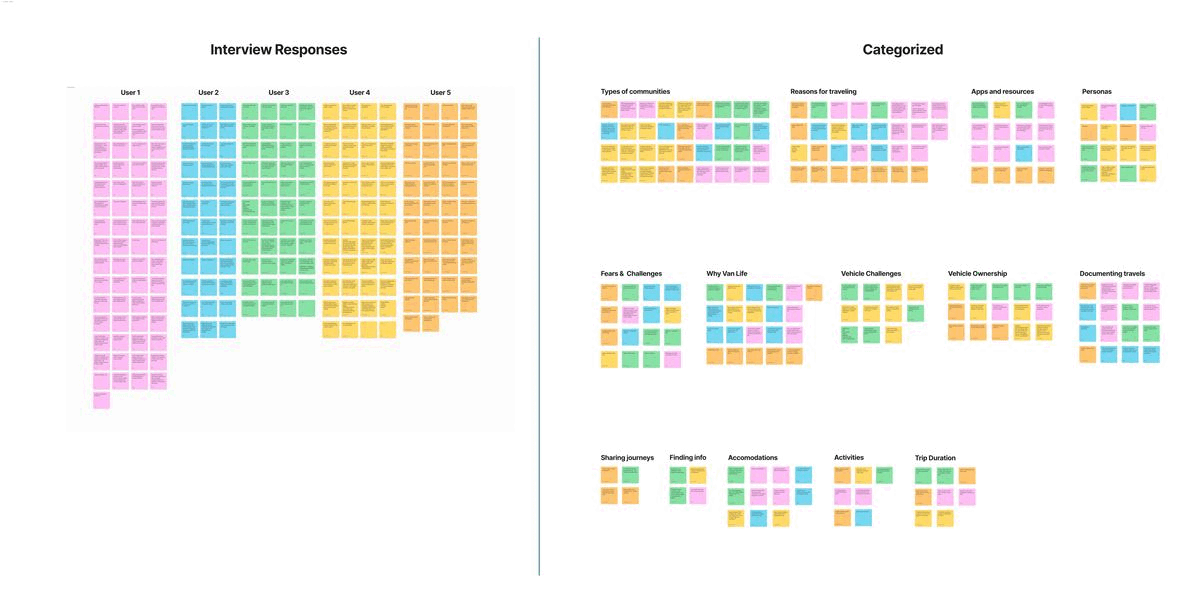
The deeper we searched, the more overwhelming our search became. It was clear there are many steps to consider when first getting started with van life, from choosing the right type of vehicle to where to park and where to camp. To fully understand the landscape and what support people seek, I took the products and websites we gathered as a team and categorized them into groups. This helped us identify our product fit, and who our direct competitors might be.
Types of resources we found
-
The vehicles: Help with buying, renting, or building a custom vehicle
-
Trip planning: Help with navigation, maps, cell coverage, and more
-
Where to stay: Finding and reserving places to stay on the road
-
What to do: Places to see, events, and things to do
-
Recommendations: Blogs and tips for living the van lifestyle
-
Community: Facebook and community groups for people to connect


There was already an app for everything!
With so many resources available, we found the biggest need in the community was doing the research itself. With so much information and countless factors to consider, it was time consuming and overwhelming to search or know where to start. We realized the biggest value we could provide would be something that could help people save time and energy during this process.
We found a handful of products helped with information consolidation, but none were all encompassing and still required the use of several apps or sites to fill the varying needs of people on the road. We felt there was opportunity in this space, but still needed to understand the users to shape the product.

Problem Statement
How might we build a platform that simplifies van life exploration, evokes inspiration, and instills a sense of community at every step of one’s van life journey with ease.
Understand what motivates the user
Once we had a better sense of potential product fit, we set out to talk to people in the van life community to learn about who they are, their travel behavior, their pain points, motivations, and their approach to van life. Understanding our user better would help us identify the best approaches to creating our product.
Methodology
We conducted 6 user interviews and collected over 30 survey responses to get to know the community and their pain points. With our user research, we gathered both quantitative and qualitative data to tell us more about the user demographics as well as their attraction to the van lifestyle.
Research goals:
-
What are the demographics of people interested in van life?
-
What draws people to van life?
-
How do they approach van life? What is their preferred travel style?
-
What are the biggest challenges they face with van life? How do they overcome them?
-
What are the digital resources they use currently?
-
What is their involvement (if any) with the van life community? What is missing from the van “community” currently?
Interview Participants:
People experienced with van life or interested in starting, age 20-70, varying gender identities, varying marital status, varying incomes from $60k to over $150k

Interview Analysis


Shared User Insights

Freedom and adventure
Above all else, van lifers like the sense of freedom and adventure that comes with being on the road.

Empowerment
Van life is a philosophy and a way of life. People do it for growth, freedom, wholeness, and self-empowerment.

Outdoor enthusiasts
Van lifers are big outdoor lovers. They care about the environment and use their vans to do outdoor activities.

Travel solo or with family/partners
Van lifers want to make friends on the road, but only if it flows with their spontaneous lifestyle, it's not a priority.

Want to learn from others
Van lifers want to share knowledge. The biggest reasons for seeking community is to learn and share their experiences.

Hardships are worth the adventure
Challenges with van life are an expected nuisance, and people are happy to put up with it to be out on the road.

Limited community & shared resources
The community is so broad, available resources are niche, scattered, and not always reliable. When trying to connect with the community or find information online, the majority of van lifers resort to the platforms familiar to them, such as Facebook groups. Instagram, Google, and Reddit.
“Community is important because of collective wisdom. Find the people that like the stuff that you like.”
With a broad user base, honing in on key insights was a challenge
After our user research, I was still challenged on how we might support this community. Vas lifers are diverse, and they approach van life from many different paths, at many stages of life, and for many different reasons. It was difficult to hone in on a core insight or user need. But after analyzing our research results in Figjam, we started to see some patterns.
Despite the large range of van life styles, pains, and motivations, we did find that they shared some core things in common. I took the lead on deriving insights from our research. Through analysis, I was able to draw common user insights, what motivates them, and how we might design a product that would be useful to the community.


What we heard...


Broad range of users
-
Travel style: From living in their van full time to only going for shorter trips
-
Age: From young without kids to families to older retired couples
-
Working: From working on the road to shorter vacations and weekend trips
-
Income: From on the cheap to being able to afford custom vans, eating out, and unique stays
-
Activities: From cities and towns to remote camping and outdoor activities
Using shared user insights to design a product that builds community
We were happy to see motivations and traits that our research participants shared in common, which helped us get to know our user's motivations more deeply. With these insights, I compiled an empathy map and we built a user persona to bring our target user to life.
The insight that stood out to us the most was the challenge users had to find community and learn from each other. People who are attracted to van life want freedom and adventure, and having to tediously scour a variety of websites and apps, while also having to vet the information for reliability, takes them away from enjoying their time on the open road.
Insight:
People interested in van life value freedom and adventure. But when it comes to planning their trips, the sense of freedom can be replaced with frustration. People want reliable resources for their journeys, but currently don’t have a centralized place to find quality answers or share knowledge. The information is scattered across a variety of websites, apps, blogs, and online forums leaving people feeling overwhelmed as they seek guidance.
Problem Statement
How might we build a product that simplifies van life exploration, evokes inspiration, and instills a sense of community at every step of one’s van life journey with ease.
Building a trusted community
We realized the biggest value we could add to this diverse community was by minimizing the energy and time spent researching the complexities of this unique lifestyle. By creating a centralized hub where people could reliably and easily get their questions answered about all things van life, we could build a trusted community and minimize the time required to research, giving users inspiration and more time to enjoy the freedom, adventure, and zen lifestyle on the road.
So we set out to identify key features and explore how we might want to design our product.

How do we simplify van life research?
We put our heads together to brainstorm, and used the "I like, I wish, What if" exercise to tease out potential features and ways of bringing the community together. We then refined these ideas and mapped them in a matrix to prioritize.


Identifying a product roadmap
We knew the product would be beneficial both as an app and a website since users would want to use it on the road, but due to our time constraints we decided to pursue the web platform first. From our user research, we found that the majority of users preferred to plan their trips on a laptop. With so much information to take in, browsing information on a larger screen was preferred.
We identified a phased approach for the product, knowing some key features such as user profiles, community chat features, and a mobile app, could be implemented at a later time.
I took the lead on sorting our desired features into groupings to create the informational architecture for the website. This helped us define our product pillars and begin sketching out short term and long term wireframe designs.


Test our product
Once we were clear on the product approach, we began the design process with sketches and wireframes. We designed a working prototype for user testing to get feedback on our approach, and began early approaches to brand aesthetics.


We needed to simplify even more
We heard valuable insights from our user testing, and iterated on the prototype before moving into design. The biggest takeaway was that users were excited to see all the information available, but due to the large amounts of content, it was critical that we simplified as much as possible and made it clear how to navigate and discover content easily.
We revisited the global navigation structure and nomenclature to improve user expectations and up-level the most popular content. In addition, we added new page navigation elements and more featured content to help users sort through the large amount of resources and find the desired information more quickly.

Updated global nav
It wasn't clear what type of content lived under each tab in global nav. In addition, added drop downs so sub-content is clear and easy to access.
-
Community → Digital Resources
-
Nomad Wisdom → Wisdom
-
Transportation → Vehicles
-
Added drop-downs for easier access to content

Simplified page layouts
Several pages felt overwhelming with the amount of content available, and users had a hard time finding information or gave up and didn't keep scrolling.
-
Reduced content
-
Simplified designs
-
Reduced copy
-
Rearranged information to make it more intuitive to the decision making process

More featured content
With so much content to sort through, users wanted to see more guides and featured content to help them get started with their explorations.
-
Added featured apps
-
Added inspirational stories
-
Added tabbed menus

New vehicle guide
The vehicle information was some of the most exciting for users, but was hard to understand the pros/cons. So we added more guides to help with the process.
-
Created a new user quiz
-
Added more charts, diagrams, and pros/cons to help with decision making
Creating an inspirational design
We explored several brand approaches, but always pulled our brand inspiration from user insights. Overall, we decided to keep the look minimalistic, both to make navigating easier on the user and to mimic life on the road. We chose to hero large beautiful imagery to inspire users with a sense of freedom and adventure out on the road. We ultimately let the imagery drive our inspiration, borrowing our color scheme from the elements one would encounter out in nature: pink sand, sage green, and lake blue, to name a few.
A validating point for us as designers was confirmation that our UI choices were appreciated by the users we tested. We made a few minor iterations in the end, taking some invaluable feedback into account such as increasing diversity of people in our assets.


Reflections
As our research progressed, I learned more and more about the van life community. The energy and excitement of life on the road became contagious, and I started wanting a van of my own!
I loved that we designed a project that I would want to use, and helped solved for a problem I experienced first hand: being overwhelmed by the complexities of van life planning. Due to the complexities of van life, aligning on a product approach was the most challenging part for our team as there were many paths we could take and many different challenges we could solve for. But through brainstorming and discussions, we ruled out alternate approaches and I believe the varying points of view ultimately led us to the right approach. By creating a centralized community and bringing the research all into one place, users could save time and find stories and resources without scouring the web.
And I knew the product had legs, because there were many more features we knew could help this community but couldn't include in phase 1. Many of these were echoed by our users during testing, so we knew we were on the right track.

